5 Tips for Custom Printing a Menu

InstantPublisher is the best self-publishing companies for hardback and paperback books, but they also offer a variety of custom printing services, including menu printing.

Menus are one of the most important tools a restaurant offers their customers to enhance the dining experience.
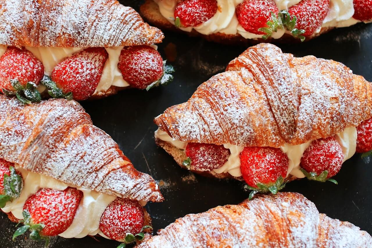
A strawberry croissant image appearing in a custom printing service menu by InstantPublisher

Here are five tips for printing a menu that will keep your customers coming back for more.

1. Organize the Menu

It is essential to make the menu easy to navigate. A customer should be able to find drinks, appetizers, and desserts at a glance. If the breakfast menu is not separate from the rest of the menu, it should be clearly labeled and the menu should indicate at what times breakfast is served and at what time the lunch and dinner menus go into effect.

Additionally, if you offer specialty menu items such as vegan, keto, or gluten-free items those should be clearly labeled.

2. Clarity

Diners want to know what is on the foods they are ordering and what, if any, sides come with their entrees.

Don’t assume that the name of an item is enough for diners to know what it is. A mushroom and swiss burger might seem simple enough but does it have mayo or a house sauce? Is there lettuce and tomato on the sandwich? Clearly listing what an item contains allows customers to choose the best match for them, as well as ask for any needed customizations, which enhances their dining experience and leads to fewer food returns.

3. Include Colored Photos

While adding photos increases the production costs of a menu, the value cannot be overstated. People eat with their eyes first. Pictures will sway customers to enjoy foods they otherwise might not try. Also, if you have lesser-known food items on the menu, it is a good idea to have them in images so that customers know what they are getting with the order.

Besides lesser-known items, include images of your most aesthetically pleasing items such as a well-dressed burger, mouth-watering desserts, and moist cuts of meat.

Don’t have space on the menu for pictures? Use the menu to direct customers to your website where detailed images of each dish are available for customer perusal. This can be a QR code, especially if your customer base tends to run younger, or a website address if you serve mostly retirees.

4. Colors

Select the right color scheme for your menu. The menu is part of your restaurant aesthetic and should match it but also not clash with the images of the food. The coloring of the menu should be easy to read and should adhere to accessibility standards for those with visual impairments and color blindness. Avoid color combinations of green/red, green/brown, blue/purple, green/blue, blue/grey, green/grey, and green/black as they can be difficult for those with color blindness to see.

When in doubt, black on white or black on cream is a good menu choice for readability. Decorative coloring can be added for aesthetics around the borders and other areas that don’t have text.

5. Choose the Right Style

Different restaurants will want to choose different menu styles. Most casual dining restaurants will find a folded menu meets their needs. If the menu is to be reusable, then lamination is a must.

Spiral-bound menus are advisable if the menu offers a large selection of food and drink items.

Formal dining venues should consider a hardcover menu.

Whether you need a menu printed or you have other custom printing services needs, InstantPublisher can help.

Call us today at 1800  259 2592 to learn more about the wide range of custom printing services InstantPublisher offers. You can also visit our website.

3 Reasons Your Book Cover Isn’t Attracting the Right Readers

Almost everyone has heard the adage about not judging a book by its cover, but that advice ignores exactly what a book cover is intended to do. Book covers draw attention to the book and give readers an idea of what is inside. If the cover of a book is wrong, it may draw the wrong audience.

Writers may think that any book sale is a good sale, and even if the book doesn’t match the reader’s taste, their exemplary writing skills will win the reader over. Rarely are they right. More often, selling books to the wrong readers eliminates series read-through, results in poor reviews on sales pages, and keeps books out of the hands of readers who will truly enjoy the book and recommend it to others.

How does a self-publishing author make sure their cover attracts the right readers? An excellent place to start is by avoiding these three cover mistakes.

1. The Cover Doesn’t Match the Genre and Sub-genre

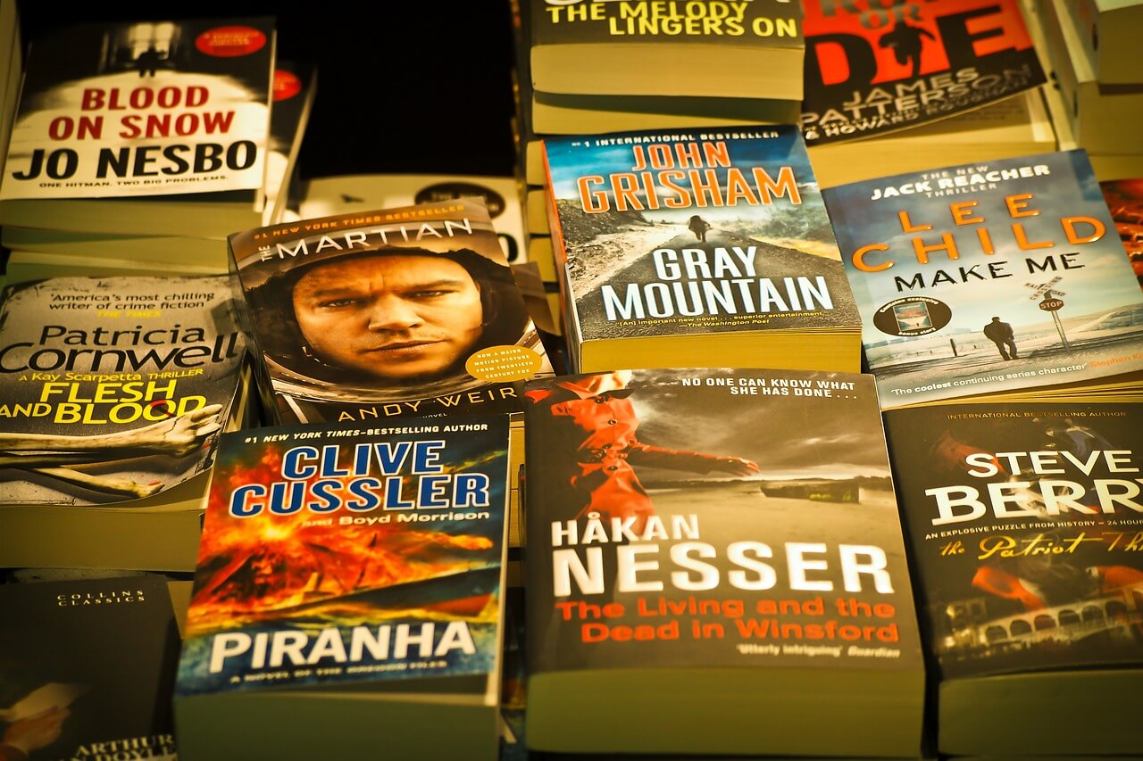
A reader should be able to tell what genre a book is simply by looking at the cover. All genres and sub-genres offer a sort of shorthand that indicates to readers what sort of book is inside. This shorthand can change with the times, and self-publishing authors should research to keep up to date on the latest trends in their genre. This is especially important in a nuanced genre such as mystery.

A collection of books displayed to show the cover images.

2. The Colors Don’t Match the Tone

Colors are an at-a-glance indicator to the reader of what the tone of the book will be. Lighter cover colors such as pinks and yellows or books with pastel-colored covers often indicate a book that will be lighthearted. The book may have some serious scenes, but most of it will be light in tone, with comedy and/or romance at the center.

Dark colors typically indicate a book that will be suspenseful, mysterious, or dangerous.

If a reader buys a book with a pretty pastel painting of a landscape on the front, they will not be expecting horrors and murders within the book. Therefore, authors need to be sure the colors on their cover give readers the right impression of the themes and tones held within the pages.

3. Gratuitous Images

Book covers should tell readers about the book’s content, but covers with gratuitous images can go too far and turn off potential readers. A horror book with a dark cover and ominous images will gain new readers better than a gory cover where the monster within the book is wreaking violent havoc.

Similarly, images with extremely sensual cover images may turn off potential readers even if those readers don’t mind descriptions of such content on the pages of their book.

In addition to turning off potential readers, covers containing gratuitous violence or sensual images will have limited opportunities for marketing. Many ad sites will refuse to sell ads for books with covers that might be offensive to a large segment of readers.

When it comes to covers, less is more. Suggestions of sensuality or violence are more effective for covers than detailed images. No matter how extreme the book’s content, the cover should be fit to sit on public bookshelves in a bookstore.

Selecting the right cover for a book is one of the most critical decisions that self-publishing authors make. The first impression readers get of a book is the cover. A good cover will cause the potential reader to pick up the book and read the description or skim through the book’s first page. An unappealing cover will cause a book to sit unread on a shelf even if the book’s content is compelling.

InstantPublisher has all the tools writers need to self-publish their books. This includes cover art templates and options to purchase custom cover art. Call us today at 1800  259 2592 to learn more about the wide range of exceptional services InstantPublisher offers.